Quid Publishing (now part of Bright Press) asked me to become involved with this project at the presentation stage after identifying an angle for a book which examines in close detail how typefaces from all major classifications are designed. The very knowledgeable Stephen Coles, ex Fontshop art director and all-round type evangelist, was commissioned to author the book, and I took the presentation styling through to complete layouts. I also project managed a large portion of the production process on behalf of Quid, liaising with Stephen directly.
… and here’s the blurb from the jacket flap of the UK edition.
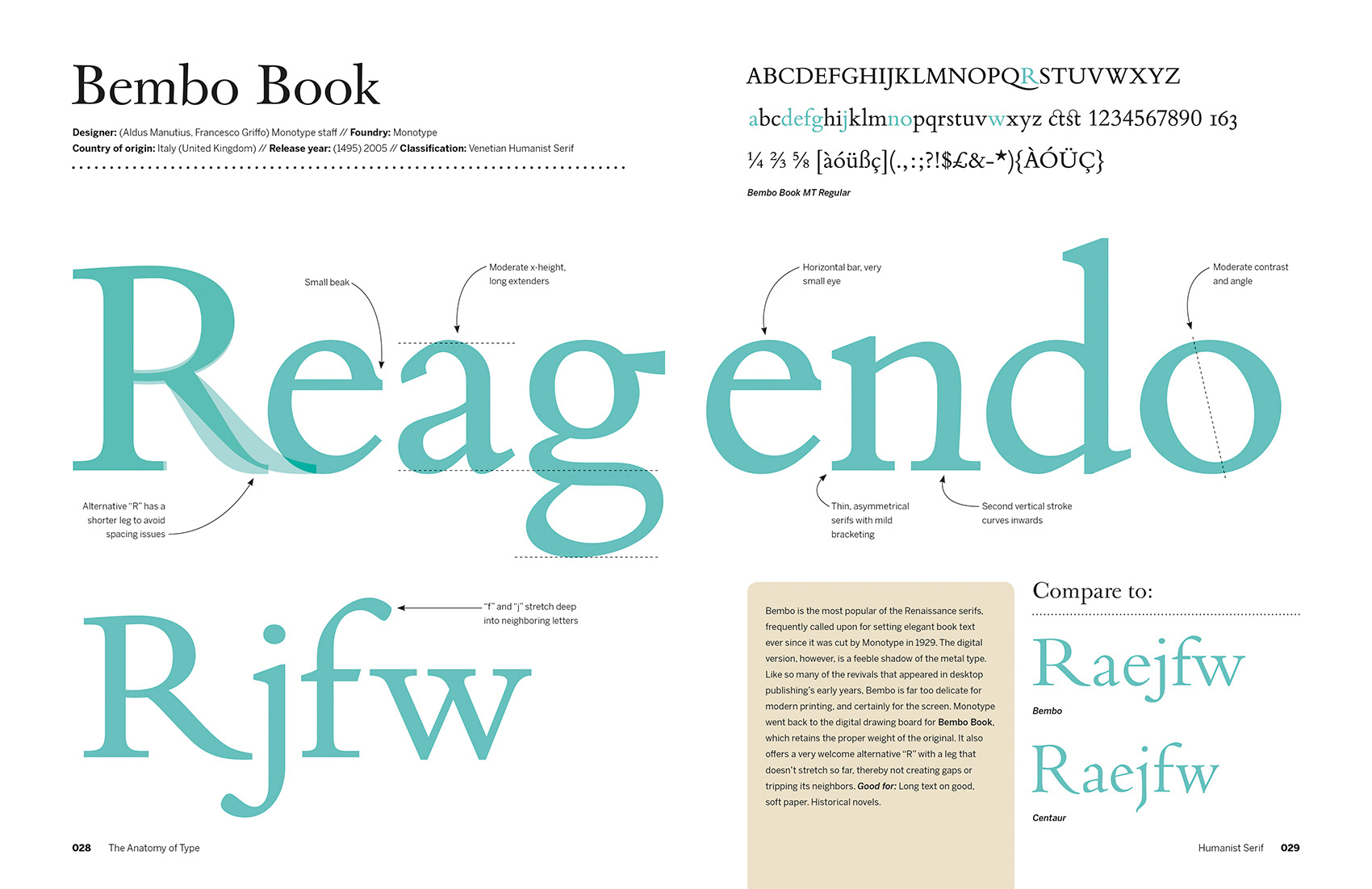
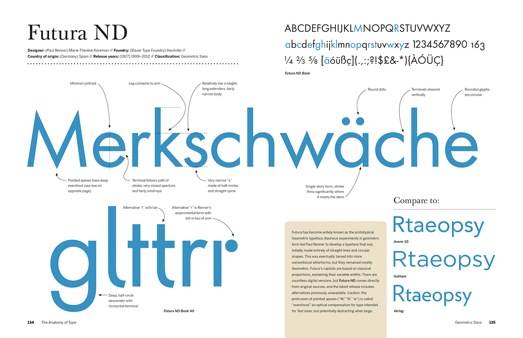
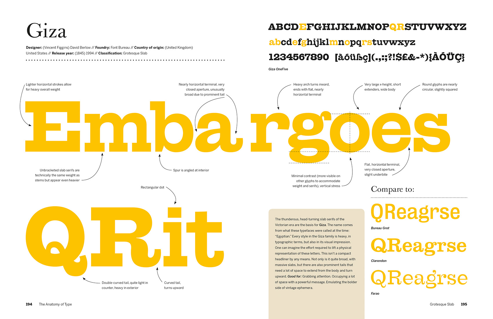
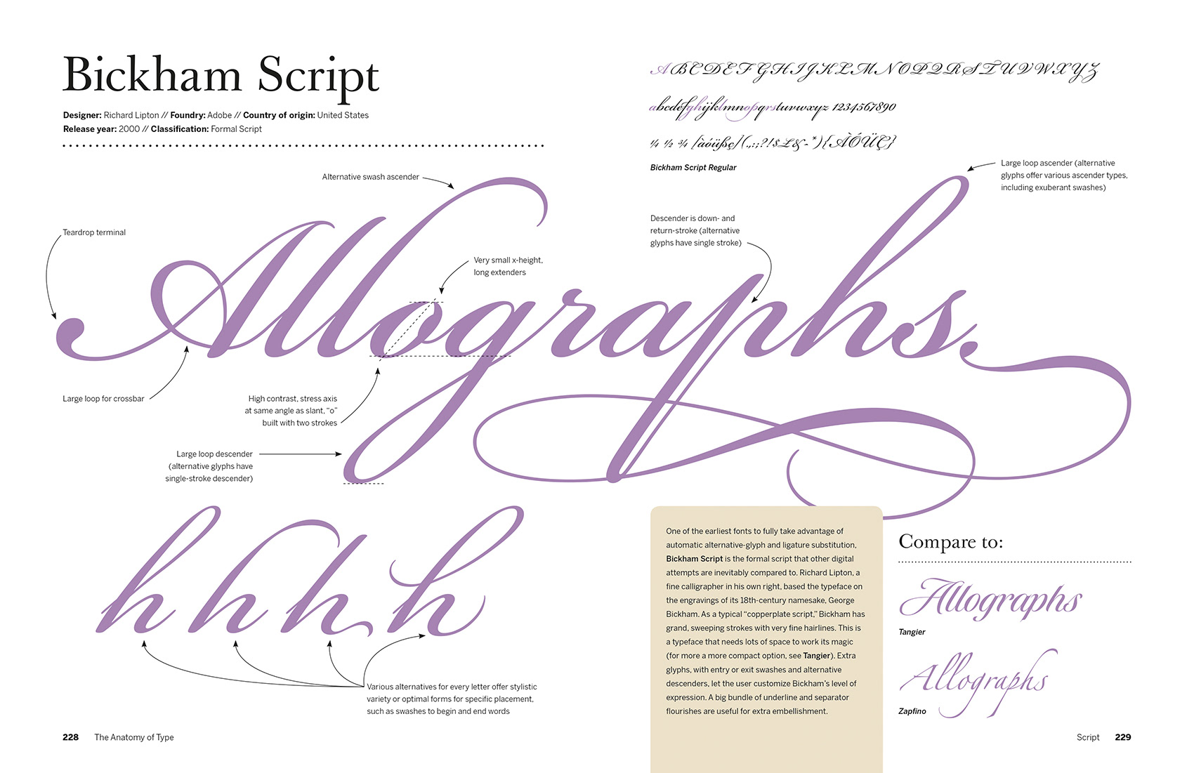
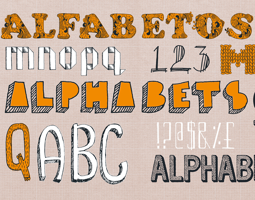
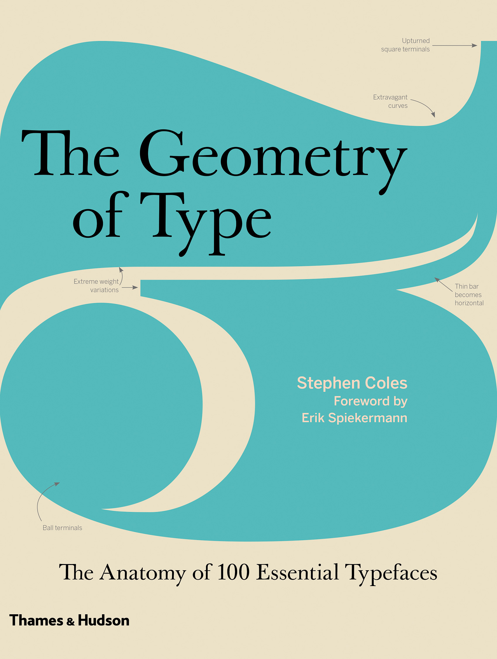
The Geometry of Type is the ultimate guide to the intricacies of typeface design. It explores 100 traditional and modern typefaces in loving detail, with a full spread devoted to each entry. Characters from each typeface are enlarged and annotated to reveal key features, anatomical details, and the finer, often-overlooked elements of type design. The book also shows how these attributes affect mood and readability.
Sidebar information lists the designer and foundry, the year of release and the different weights and styles available, and feature boxes explain the origins and best uses for each typeface. To help you spot each typeface in the wider world, the full character set is shown, and the best letters for identification are highlighted. A beautiful and highly practical work of reference for font spotters, designers and users, The Geometry of Type is a close-up celebration of typefaces and great type design.
The book was published in the UK by Thames & Hudson (as The Geometry of Type) and in the US (as The Anatomy of Type) by Harper Design.