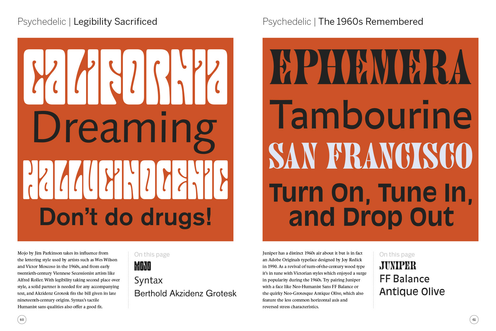
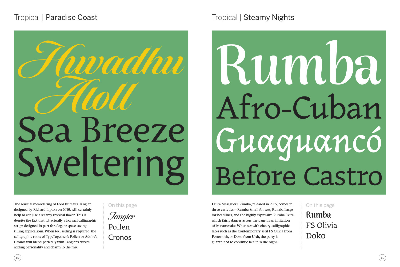
Quid Publishing (now part of Bright Press) asked me to design and author this title which was published by HOW Books in the US and by Thames & Hudson in the UK. The content is split across 32 separate categories which place the suggested typeface combinations into different contexts; for example Neoclassical, Mid-century Modern, Tropical, Urban, Industrial, Whimsical, Vibrant and so on. These categories are interspersed with a selection of 10 key typographic principles (such as “stress” or “contrast”) and 14 type tricks (such as “mixing serifs and sans serifs”). The 149 typeface combinations are designed to be flexible as well as inspirational, taking into account the fact that readers will probably not have every typeface in the book at their disposal. The suggestions are jumping-off points, allowing the reader to use their own imagination and typographic taste to form the combinations which best suit their own projects.
Here’s the blurb from the book’s back cover
Every creative brief requires its own unique typographic solution to achieve both individuality and visual harmony. This is why the question “what’s the best typeface combination?” is impossible to answer succinctly. Typefaces are a bit like people; their personalities can alter ever so slightly when you bring them together in different groups. A stern Geometric san serif can act the part of a plain disciplinarian when standing next to an equally restrained Transitional serif, but can become light-hearted and playful when it encounters a lively Casual script or a burly Slab serif face.
Choosing typefaces that work well together is ultimately as subjective as it is scientific, as personal as it is informed, and as debated as it is agreed upon. The suggested type combinations illustrated throughout this book are designed to provide the information and inspiration you need to make the best choices you can when bringing typefaces together.